Sunday 22 December 2013

Art & Design: Urban Landscape; Final Evaluation

Art & Design – Urban Landscape
Robert Salisbury

We were given the brief to create a piece to the theme of Urban Landscape that was A3 or larger, in order to do this we were asked to experiment with and develop different techniques. 

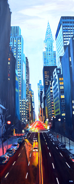
After a fair bit of experimenting I decided I was going to use two main mediums for my final piece, the first was going to be painting using acrylics, I came to this by trying different painting techniques and tools and found that I really enjoyed working with acrylics.  The second medium was computer illustration, now I came to this via a drawing route, I really found an interest in the perspective drawing that we were shown, and decided to develop my sketches further by scanning them into the computer and vectorising them, this allowed me to further edit the drawing until I was happy with it. 

So for the first part of my final piece I was going to paint a background, having chosen acrylics I went onto experiment with colours to find the ideal choice. 


This was the first background I created, now although I like the colours used this turned out to be too dark in the top half and didn't really work with the second half of the piece. For this reason I decided to change to a lighter colour.


I kept the darkness to the bottom half of the piece but used a mixture of black and white acrylic to create a nice greytone for the top half, this was then light enough to take forward. 

Having now created the background for my final piece, it was time to take the second half of the work and get it applied. 

For the second half I developed my multiple perspective sketch into the following digital illustration...


I then printed this onto clear acetate in order to overlay it onto my painted background. Now I was limited to the sizing of this as the college printers would only print to A3 at largest on acetate, so my piece would have to be A3 size. 

I then took the acetate print and painted white acrylic onto the back in random light spots in order to give some highlights in randomly chosen areas, I feel this really gave the piece an extra dimension.


Next I overlaid the acetate onto the background and fixed it into place by applying a card boarder. 


My final piece was then completed, I'm really happy with how it came out although I would have liked to have been able to produce it on a larger scale, but due to the printing restrictions this wasn't possible at the time. Moving forward, I would like to develop my painting skills further, and one thing I will definitely be doing again is the perspective drawing. 


Art & Design: Urban Landscape; Developing Painting.

To accompany my developed sketch (Illustration) for my final piece, I thought I'd add in some painting to really mix medias.

As I'd never really delved into painting before this course, I thought I'd give it a try, so I started by following Tony's tutorial with water colours,


In the piece I tried to lay down blocks of solid colour first and then add in black outlines later on to suggest the building, I like the look of the technique but I don't think I executed it quite right. My perspective is all wrong, but at this early stage I was still learning about perspective. If I could go back I would have put more effort into getting the perspective correct before building up the colours. For the trees I used a technique taught in lesson which was a simple one of using the texture of the paper to your advantage to suggest the leaves on the trees, I think this really worked and was very happy with it.

Moving forward I decided to venture into acrylics, this is something I've always been interested in trying. 


These two pieces were created using mainly acrylics, the first was created using a piece of card to apply the paint. I scraped down to create the shapes for the buildings and went on to add detail with pastels. I liked the painting side to this, but I didn't enjoy creating the whole piece with just acrylic and felt it needed something else. The second piece was more of an experiment, I wanted to try and lay down some block colours and planned to build it up light in front to dark at the back, this is unfinished as I decided I didn't quite like painting the buildings in, the background I really thought worked with acrylic but the buildings needed to be created via another medium. 


Thursday 19 December 2013

Textiles in Art & Design – Marks in the Landscape - Evaluation


Textiles in Art & Design – Marks in the Landscape
Robert Salisbury

We were given the brief by Susan Siddle of the Neo Artist and were tasked with creating a textiles artwork for an upcoming exhibition to the theme of ‘Marks in the Landscape’. To utilise the space at the gallery Neo required both 2D and 3D submissions, so we needed to explore both throughout our development.

At the beginning I was struggling to find my way with the whole idea of textiles, I was very new to this to say the least. So without an idea or a concept I was just plugging along with the tutorials and exercises trying to find my way.

I found some of the techniques interesting although some of the others  didn’t  really capture my imagination. The one thing I did really enjoy was the freedom to experiment with different materials, as I was used to simply using a computer for my artwork. The opportunity to get messy and really experiment proved fruitful, adding the environment and peers to the equation really got my mind working and the ideas soon began to flow.

One of the first techniques I really got stuck into was the transfer printing, although I didn’t really like this and probably decided there and then I wouldn’t be taking it any further after the session. However  the second part of the session was the lino print style technique using a foam board to create an impression which we then added paint onto and rolled onto fabric to create a printed piece. This technique I really found interesting and took a lot from, I decided that I would probably try to re-visit this in the future.

The next technique we explored was Suffolk Puffs, at first I thought this would be a simple process but soon came to realise what can appear simple may not always be. It was quite difficult to get it to work and my sewing skills were beginner to say the least. I wasn’t keen on sewing at all, and didn’t want to take this process forward.

Moving on we tackled the Applique process, I really enjoyed this and although we speeded up the process slightly I did really begin to get stuck in and create samples I actually liked. I took a lot from this process and would definitely use it in the future.


 To further explore materials we decided to test the limitations of fabrics by using various methods to distress and manipulate them. For this I used burning, bleaching, ripping and cutting to really explore the physical properties and characteristics of different materials.

It was at around this stage I decided to venture into the use of computers, I work with computers on a daily basis and during my lifetime I’ve really seen a rise in computer use so decided that these were the marks in my personal landscape. My idea was born and I started to research how I could incorporate computers into my final piece.

For this I researched about computers in art but decided to go down a more physical route of actually using pieces of computers to create art, by this I meant finding a way to use computer components to create a physical piece of artwork. I got a load of computer parts and really started to explore them, I spent a while pulling them apart and finding their limitations, understanding the physical properties of these components would be vital to creating a final piece from them.  After pulling apart the computers and playing around with different pieces I made the decision to attempt to build a cityscape out of the motherboards and chips. This was going to be difficult as I needed to find a way to fit the pieces together to create buildings. The idea behind this was to create a city which represented what I believe to be the most significant development on society in my lifetime, computers.

Moving forward I looked at different methods of fitting together, I tested cutting grooves in the pieces, soldering them together, and various ways of stitching them together with both cotton thread and a more sturdy option of thin metal wires. Unfortunately I kept hitting a dead end as none of the methods were strong enough to hold it together, it would of ended up looking more like a horrific bomb site rather than a cityscape. This was where I made the decision to move away from the 3D city idea, and more towards a photographic display idea.

My idea was still the same, to make computer components appear to be an urban scene, and ultimately portray my idea in any way possible.


So I fitted together small pieces of components and pulled apart pieces I believed I could make look like buildings. The task then turned to finding a location to display these and compose some photographs that would give the look of an urban scene using computer parts, as buildings. I eventually chose my location, it was a multi-story car park, with a wall in the close vicinity. The wall acted as a platform for me to build my model cityscape, with the car park in the backdrop to add a city feel to my eventual image. This adaptation of my original idea meant it was no longer a sculpture as such, although it does still have elements of a sculpture but it was now a site-specific installation. I strategically placed it at the location so it altered the perception of the space it was installed in, this then gave me my intended outcome, but through a different process.

 The images I captured came out extremely well, I was very happy with the outcome and then chose to display them by hanging for everyone to view, hanging them would allow them to be clearly displayed while taking up minimal space. I don't like the fact that I failed on my original idea, that's my only regret.

If I was to do anything differently, I would probably have liked more time to really find a way of holding the pieces together so I could create my initial idea on a large scale. I was quite disappointed that I wasn’t able to do this and although I’m happy with my final piece and the methods I used I would like to go back in the future and re-try the initial idea.


Monday 16 December 2013

Art & Design - Urban Landscape; Developing Sketches.

Right, so after watching Tony's brief tutorial on perspective drawing I decided to give it a go, I though I'd start where he showed us and go for one perspective. Below is the sketch I came out with, basically a view looking down a street of houses.


This was quite a simple task, but one that I learnt a hell of a lot from. This also gave me the idea and inspiration to take this technique further and develop it.

In order to develop this style, I introduced multiple perspectives to my work. The sketch below is what I came up with when working with multiple perspectives.


The idea for this came from a mixture of secondary sources (photographs) and my own mind, this piece really caught my imagination and sparked the beginning of the concept I planned to go on to develop even further.

So, after this came out pretty well, I noticed that the layout of the piece was very similar to the perspective grid in Adobe Illustrator, and coming from a computer background, I didn't need an excuse to jump onto the MAC and develop this even further.

So I took the image and scanned it into the computer, I then used the perspective grid in Illustrator to line up the image. The live trace feature allowed me to vectorize the shapes and turn them into solid objects.

Then after some work, I was able to create more detail in the building which resulted in this...


This is where I really found myself, and planned to use this on my final piece. However I once again decided to take this further, and again develop it.

So, back into Illustrator I went and duplication the whole image a few times, each time applying different effects and playing around with the opacity.

The my once humble sketch became a real finished piece in it's own right, this is now the vector I will use on my final piece...


Evaluation:

So I thought the process and technique of the perspective drawing was extremely useful, it helped me develop ideas and gave me the basis to build my urban landscape for my final piece. If there was any bad things about it, it would be that I would maybe have liked to use a primary source for this, however I'm not the best photographer and wouldn't be able to compose a shot of the calibre needed to pull this off, therefore it was left to what I am good at, taking something so simplistic and turning into high quality digital piece of art - I feel I really explored mixed media in this piece.

Art & Design - Urban Landscape Research; Sources.

There are different kinds of sources in art, they can be documented in many different ways also, so here's a brief explanation of them.

Primary Sources:

Primary Sources are basically a firsthand account of something, may it be an event, location etc. These can be recorded in different ways, whether they're documented in writing or in images - to be Primary they must be documented in some way by the witness to the event, location etc.

Secondary Sources:

A Secondary Source is therefore something that wasn't witnessed by the person using the source, it's simply becomes their interpretation of someone else's primary source. Secondary sources often include pictures, quotes or graphics that have taken and interpreted by someone else.

My Primary Sources:

These are some images I documented on route to college one evening, these are evidence of my ability to identify and record my own primary sources.


Secondary Sources:

Here's some images I found while researching urban landscapes, these were documented by someone else therefore they're classed as secondary sources.


Sunday 15 December 2013

Textiles in Art & Design - Research

Do Ho Suh - 1962, Seoul, Korea.

Do Ho Suh a Korean artist really inspired me, he achieved a BFA in painting from the Rhode Island School of Design and a MFA in sculpture from Yale University. He is interested in the malleability of space in both it's physical and metaphorical manifestations. He creates installations specific to each site, his work explores the relation between individuality, collectivity and anonymity.

He has just completed his largest artwork to date, the piece called "Home within home within home within home within home" situated at Seoul's National Museum of Modern and Contemporary Art, the installation represents two previous homes he lived in at 1:1scale, built with silk the structure gives the impression of a 3D blueprint.

The two homes splice traditional Korean homes with a modern apartment building from the United States, the piece is so large visitors can walk inside and explore it.


Art & Design - Urban Landscape Research

While researching various Urban Landscape artists I came across some, who's work I really, really like. The first one is Angela Wakefield, she paints contemporary Urban Landscapes which are quite stunning.

Below are some pieces of her work.


The realism of them is extraordinary, they almost look like edited photographs. I really like this kind of work, will keep an eye on her future work.

The second artist I became really fond of is Leo Verhoeven, his work is usually based on London cityscapes as he focuses on modernist architecture. His use of colour and the simplicity of work is genius.


I think I'm drawn to the work by these artist because of my love for illustration, given my computer background I can really relate to the style of work, although these are not created using a computer, the style is very, very similar to a computer illustrated piece. 


Friday 6 December 2013

Textiles in Art & Design - Image Maker

After taking the computer components apart I decided to try and develop some ideas that had come to me. I started by photographing different parts of the computers.


This is a built up section of parts that resemble two things in my mind, firstly I though it resembled an industrial type scene but also secondly it could easily be perceived as a petrol station. You do have to be open minded to see different things within this though. 

So I then took a close up photograph of a section within this structure;


Now this close up really has an industrial feel to it in my opinion, so I decided to go ahead and use this image. I then decided to develop it into a textile sample by using Image Maker. 

Image Maker allows you to transfer photocopied/printed pictures onto fabric, using black and white or coloured photocopies. 

Here's the method;  

1. Print/Photocopy the desired image and choose the fabric you want it to be transferred onto.

2. Apply Image Maker paste/solution evenly over the picture, be generous with the paste.

3. Place picture onto the fabric, paste side down.

4. Press the picture on firmly, smooth out any wrinkles.

5. Allow to dry, use a hair dryer to quicken up the process.

6. Soak the printer paper and gently rub it away, starting in the centre and working outwards.

7. Allow the fabric to dry and apply oil to it in order to seal the surface. 

So, using this method I developed the picture into the following sample;


It didn't come out too good, and I believe the reasons for this to be;

1. Image was black and white and not colour.
2. I didn't apply any oil after it dried. 
3. Fabric wasn't the best. 

So, with the flaws I believed to be the problem in mind I decided to have another shot with a different image to see if I could improve the final outcome. 


New image is a of a colourful circuit board, I then followed the steps and I feel it came out a lot better than my first try, I used a better material which took the transfer better. I then added oil as the final step and which really helped the image lift and gave it an added dimension, it literally looks like a photograph on fabric.

I was very please with the outcome on this.


Outcome.

Textiles in Art & Design - Progress

So i've been playing around with computer components trying out different things in order to get an idea for my final piece.

Here's some images of computer parts I've pulled apart and dismantled.


Found myself becoming fascinated in the circuit/mother boards themselves during this, they almost look like cities from an aerial view with all the lines and channels. 


Textiles in Art & Design - Material Distressing/Manipulating

Not updated in a while so thought it's best to catch up, I didn't update on this task at the time so I'll start here. We had two distressing tasks the first was with a netted material made from individual strands and the second was with a mesh type copper material.

I went with the same theme for both and attempted to dismantle them and re-construct them into batches of wires (going along my computer theme)

Here's the first;


I pulled the individual strands apart and then clustered them together using strands to tie them into place.

Here's the second;


I used the same technique again with this one, obviously this one came out a lot better as it was stronger and held together far better.